


Details
Role
UI/UX Design, Front-End Development and Project Management
Type
Design System
Year
2020
Why it is needed
Accelerate time to market
Design systems enable teams to tap into the library of reusable assets, shortening the time they would otherwise spend rebuilding the same assets.
Achieve UX consistency
Standardized components and ui patterns assist in creating a more unified look across products and platforms.
Improve team collaboration
A shared design language allows product teams to learn and grow together which greatly improves productivity and collaboration.
Reduce cost
Reusing existing components across projects is a proven way to save designers’ time and consequently money.
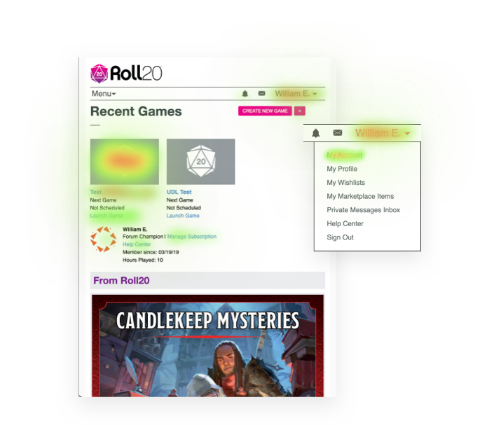
Visual audit
The first step I took in building a design system is to do a visual audit of Roll20’s current design, this included the front end Web App (website) and the Virtual Table Top. While taking inventory of the css Roll20 was using and the visual qualities of the elements, I was able to gauge how much of an undertaking this process might be.
Visual design language
The visual design language is the core of a design system. It’s made up of the discernible components that we used to construct our digital product. The Roll20 visual design language is made up of six main categories, where we went to great depths in understanding the role each of these design elements plays in every component on the screen.
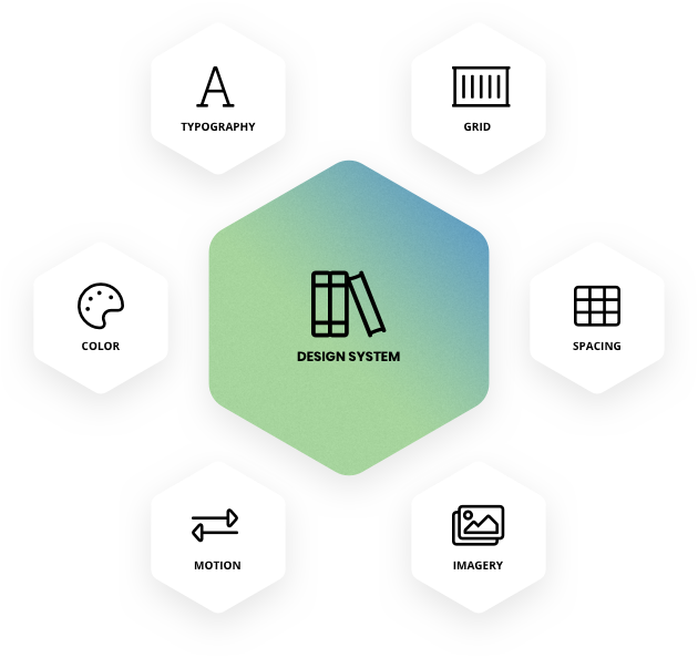
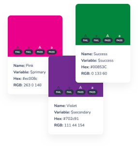
Color
Common colors in the Roll20 Design System include primary and secondary colors that represent its brand. A wide range of tints—a color mixed with white—and shades—a color mixed with black—to offer up light and dark background options.
Typography
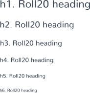
The Roll20 Design System includes 2 fonts: Nunito font for both headings and body copy, and Chalet Comprime Hong Kong Sixty for secondary headings or lead text. It is key to keep it simple to avoid overloading and confusing the user. It’s not only a best practice of typographic design, and it also prevents performance issues caused by excessive use of web fonts.
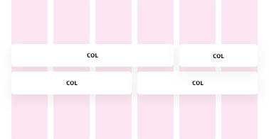
Grid
Consistent use of a grid system provides the foundation for harmoniously and consistently positioning elements onscreen. Designing to the grid helps create an experience that facilitates understanding and brings order to the page.

Spacing
Every part of a UI should be intentional including the empty space between elements. The amount of space between items creates relationships and hierarchy. The Roll20 Design System takes a lot of the guesswork out of spacing to help designers and developers deliver clear, functional layouts.
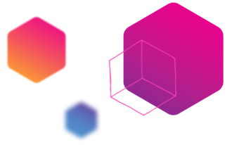
Imagery
The key to success with imagery in a visual design language is having a plan and sticking to it. Set guidelines for illustrations and icons, and use the best image format for the situation.
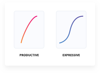
Motion
The Roll20 Design System observes different types of moments in users’ experience and offers two styles of motion—productive motion, and expressive motion. Reserve expressive motion for occasional, important moments, to better capture the user’s attention and offer a rhythmic break to the productive experience. Productive motion creates a sense of efficiency and responsiveness, while remain subtle and out of the way. Productive motion is appropriate for moments when the user needs to focus on completing tasks.
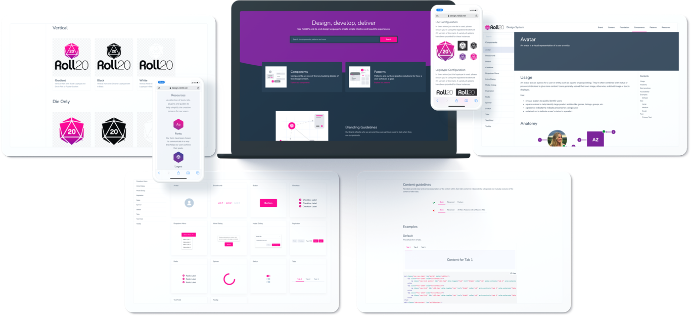
Creating the UI Library
Unlike the visual audit we’ve already conducted (which looked at the visual qualities of Roll20 design elements), this step in the process looks at the actual components of the Roll20 UI. We collected all of the parts and pieces of the UI currently in production. That meant every button, form, modal, and image.
Choosing a Platform
After much thought and research I settled on pitching the idea of using Hugo as the generator for the documentation site. The primary reason is that the build process is extremely fast. While this can be insignificant for smaller sites, many documentation sites can grow very large and unwieldy, making the build process a bottleneck in updating and deploying the site.
The secondary reason is that Hugo does not come pre-configured for running a blog—a format that’s unsuitable for most documentation sites. This makes it easier to set up Hugo for whatever site structure we need for our documentation site without needing to restructure the default setup.
Documentation
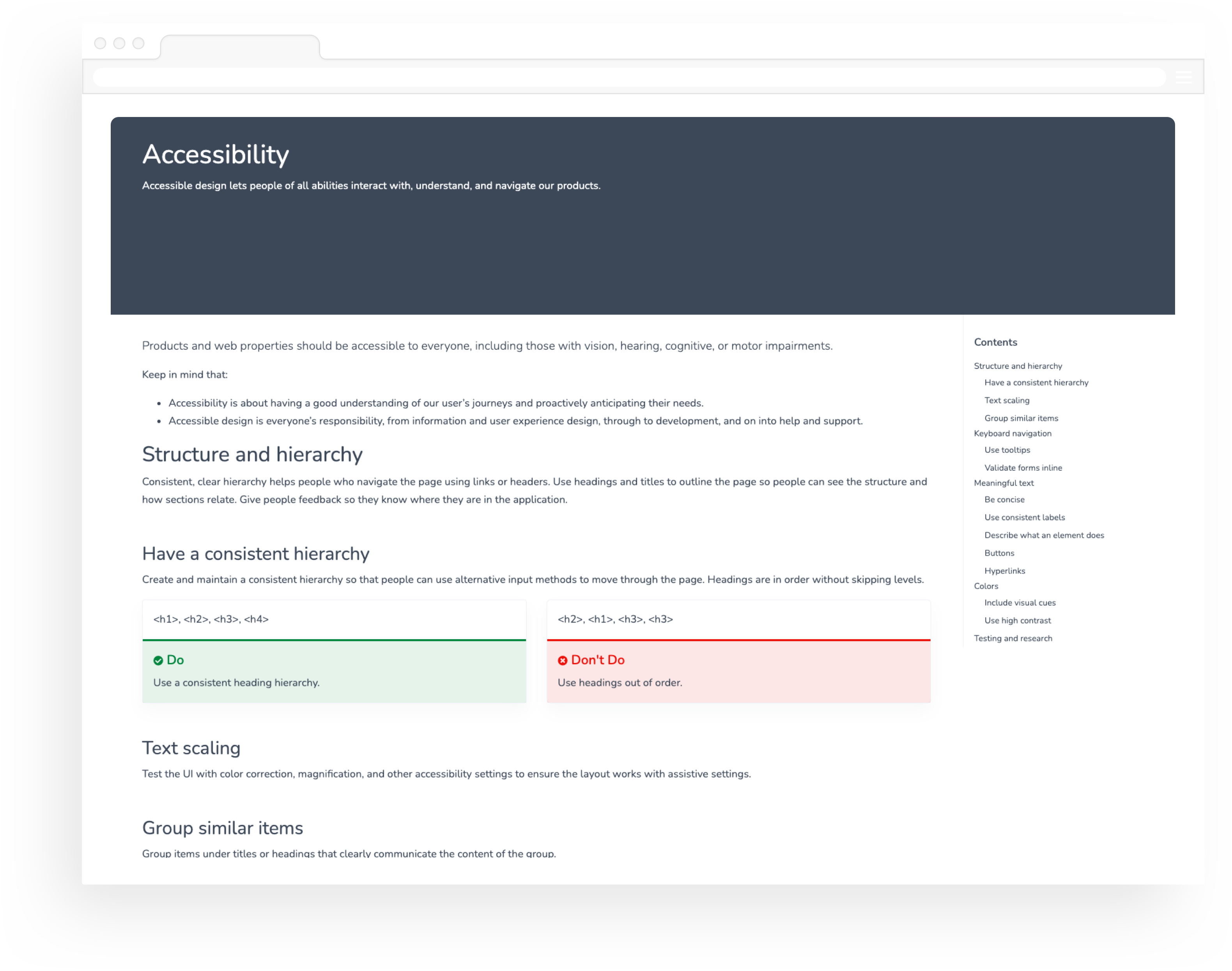
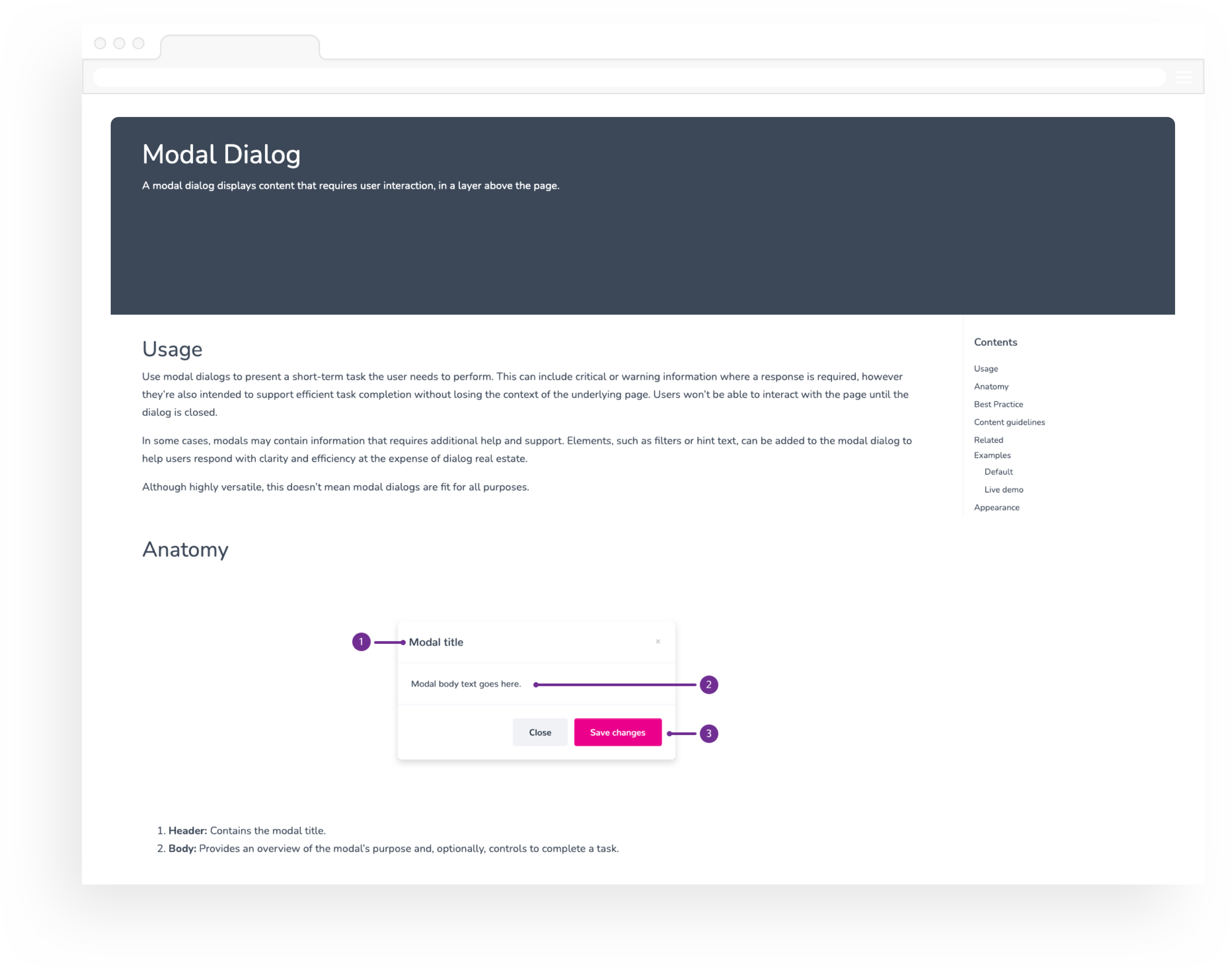
This is where rubber meets the road. Documentation and standards are what separate a pattern library from a true design system. This includes defining usage and showcasing examples such as a components default appearance, size, color, disabled status and accesibility tips.
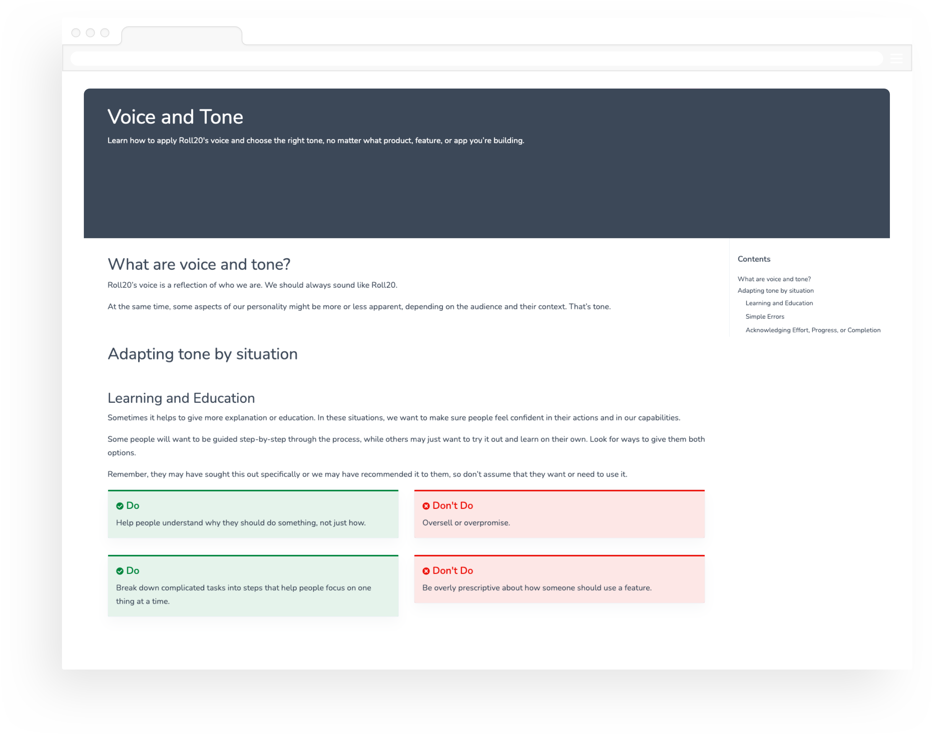
Content guidance covers our voice and tone, and the mechanics of Roll20 grammar and style.
Foundations are the visual elements needed to create engaging layouts and end-to-end user experiences.
A standalone UI element designed to be reusable across many projects.
Let's make it happen
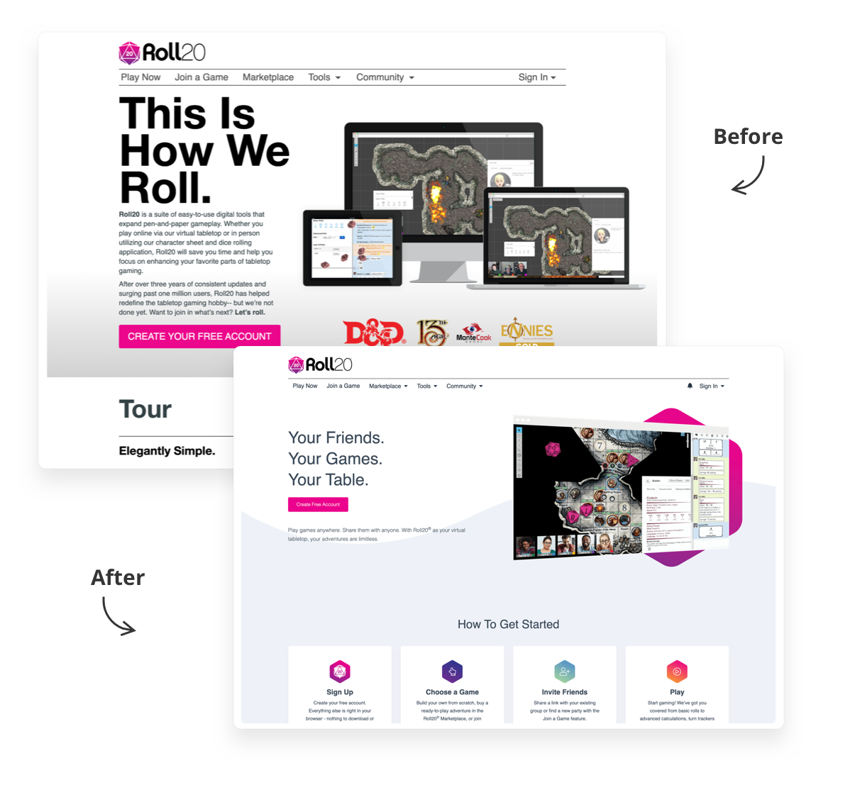
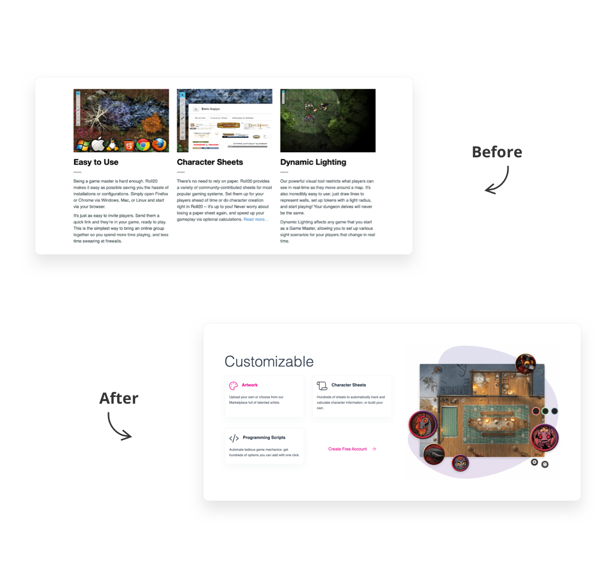
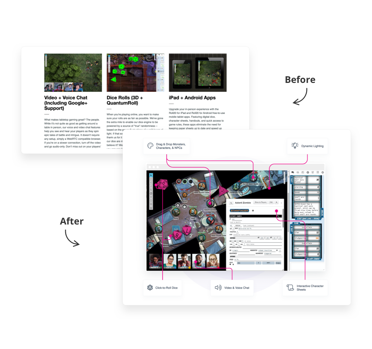
During my time at Roll20, we have redesigned pages that are key to the user signup flow. Below are some Before/After examples.
Home Page Redesign
My final thoughts...
Design systems come with a distinct set of challenges. Getting buy-in and the right governance process in place to support the project takes a lot of effort. They are also very time and resource intensive, which added to my already heavy workload.
This project brought so many benefits to the organization, from aligning teams, to reducing duplication of effort and menial tasks, to improving accessibility and consistency of brand and experience across products. In the end, we are solving problems and helping people across Roll20 to work faster.