
Details
Roles
Project Manager, Designer, and Front-End Engineer
Type
Design System Creation & Implementation
Year
2022
Introduction
The team consisted of myself and a product designer. Through close collaboration over 12 months, we brought an outdated "design wiki" to modern times. Our initial discovery efforts revealed that the product had multiple pages that were using one-off components. This created blockers for the design team, the product team, and the users.
From this evaluation, we recognized that we needed to prioritize addressing these issues for the product itself and the teams that relied on this information in order for the company to successfully reach their quarterly business goals.
Where do we start?
Broke the project down into multiple phases with achievable milestones.
1. Alignment
Met with the engineering team to gain insight into current tools and areas of improvement.
2. Guidelines
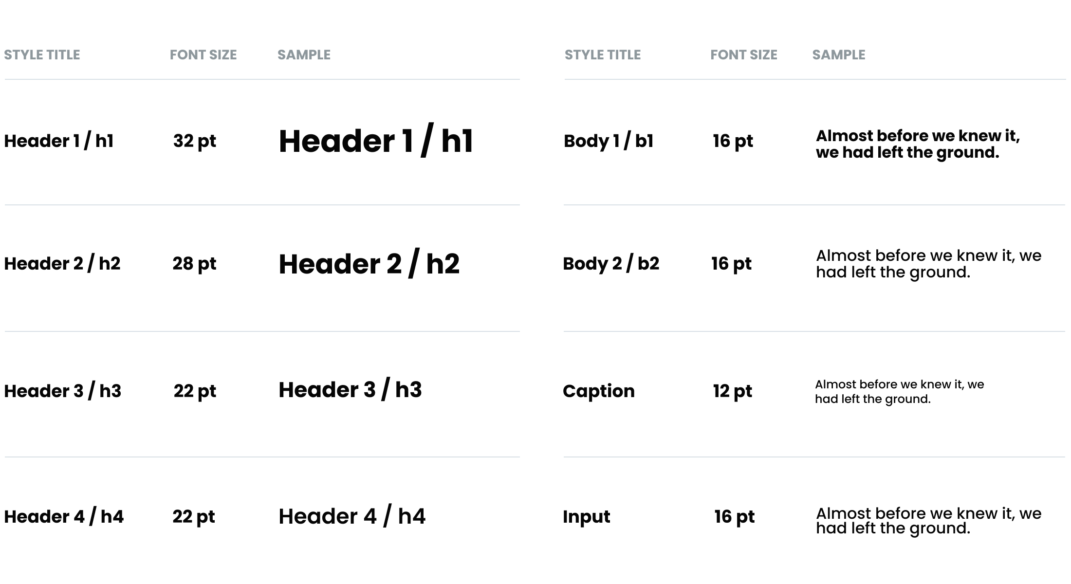
Wrote content guidelines for typography, color palette, and elevation.
3. Components
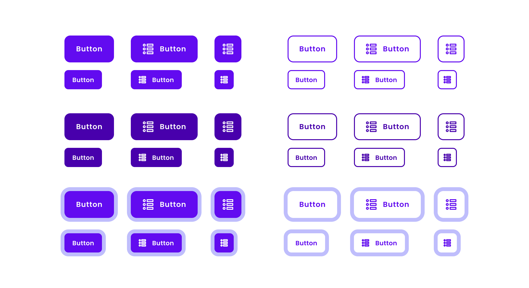
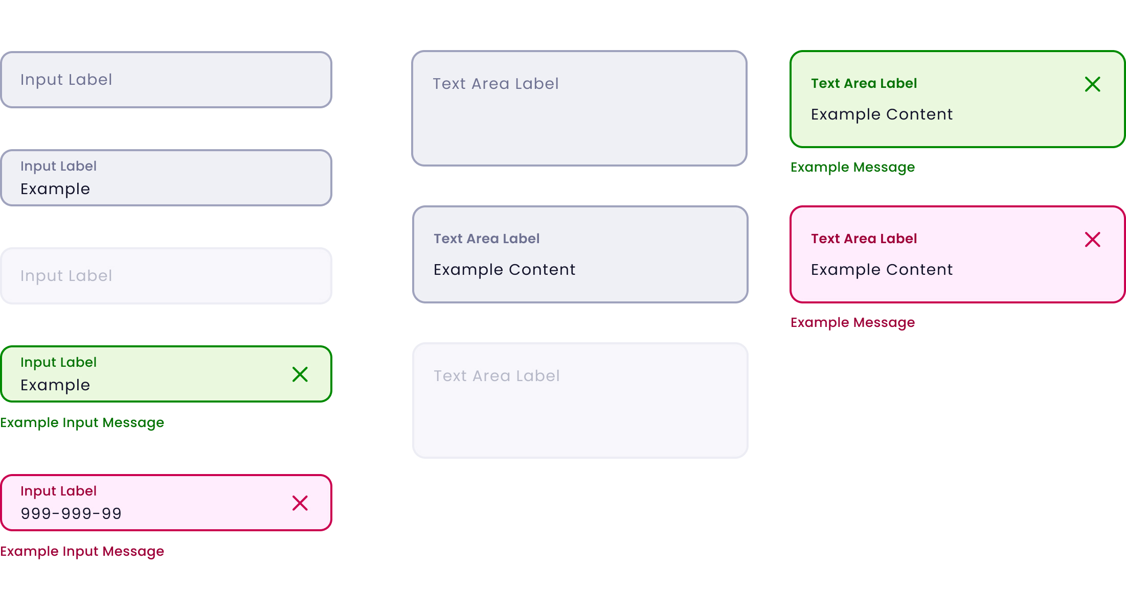
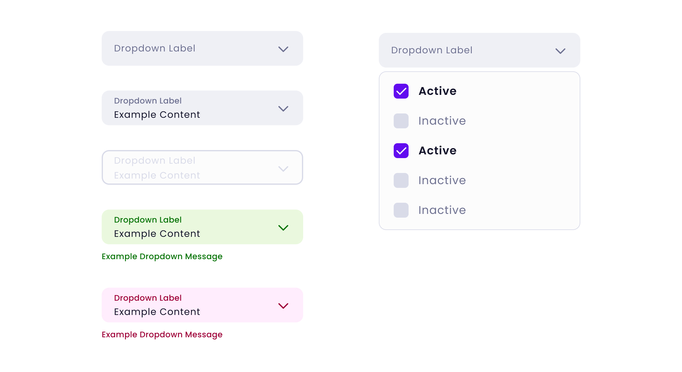
Took inventory of current components and categorized them using the Atomic Design Methodology.
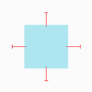
4. Spatial System
Set standards for padding, margins, sizing, and spacing user interface (UI) elements.
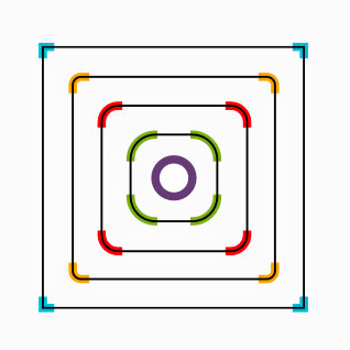
5. Organisms
Identified UI patterns as organisms and created guidelines for their usage.
6. Governance
Defined the framework for clarifying roles, responsibilities, and authority over decisions.
UI Audit
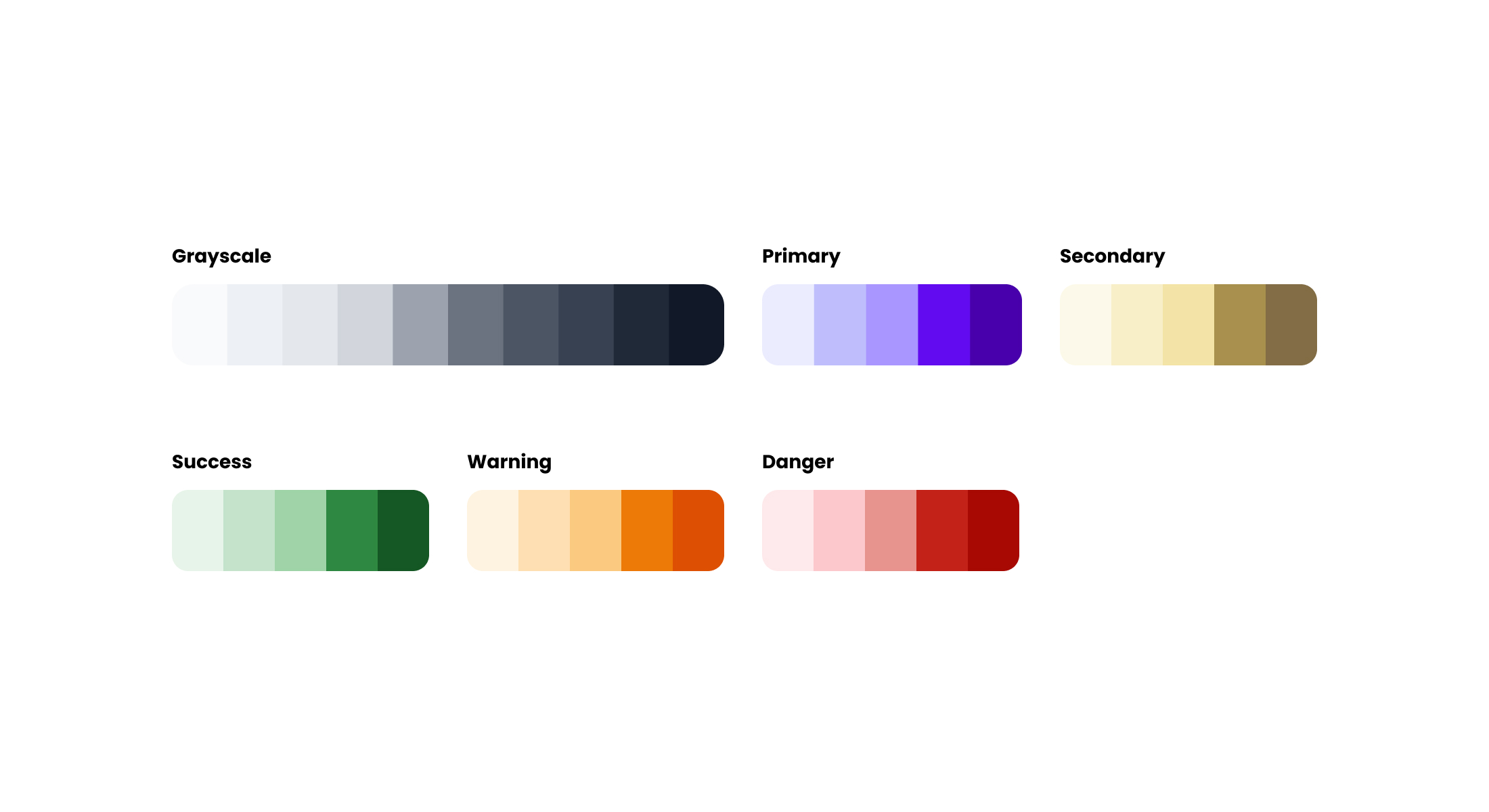
Our goal was to define a working set of foundational design principles and styles. These styles would become our Design Tokens which would inform and translate to any UI component the team might design. The benefit of abstracting and tokenizing these design decisions allowed us to develop a system that would be platform-agnostic and be a single source of truth to maintain the Quorum product line.
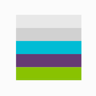
Colors
Typography
Space
Radius
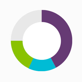
Data Viz
Elevation
Architecture
We looked at Quorum's Design System (DS) from an aerial perspective and accounted for the different pieces, processes, and teams that would need to be in place to gain traction and scale within the organization. Our goal was to lay the foundation for a platform-agnostic DS that would scale for any team regardless of the front-end framework. The Quorum DS comprises four core pillars: Design Kit, Dev Kit, Documentation, and Governance.
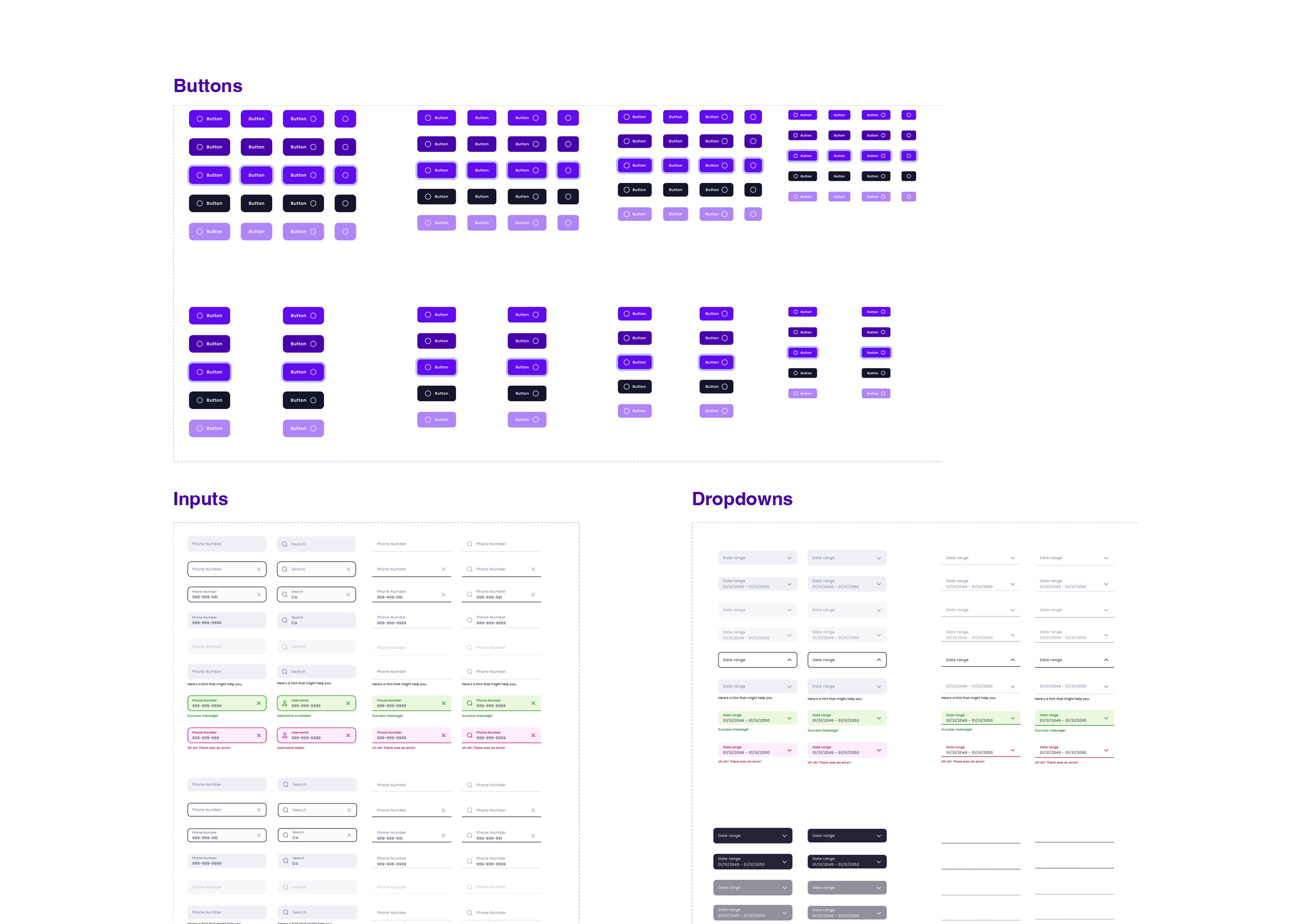
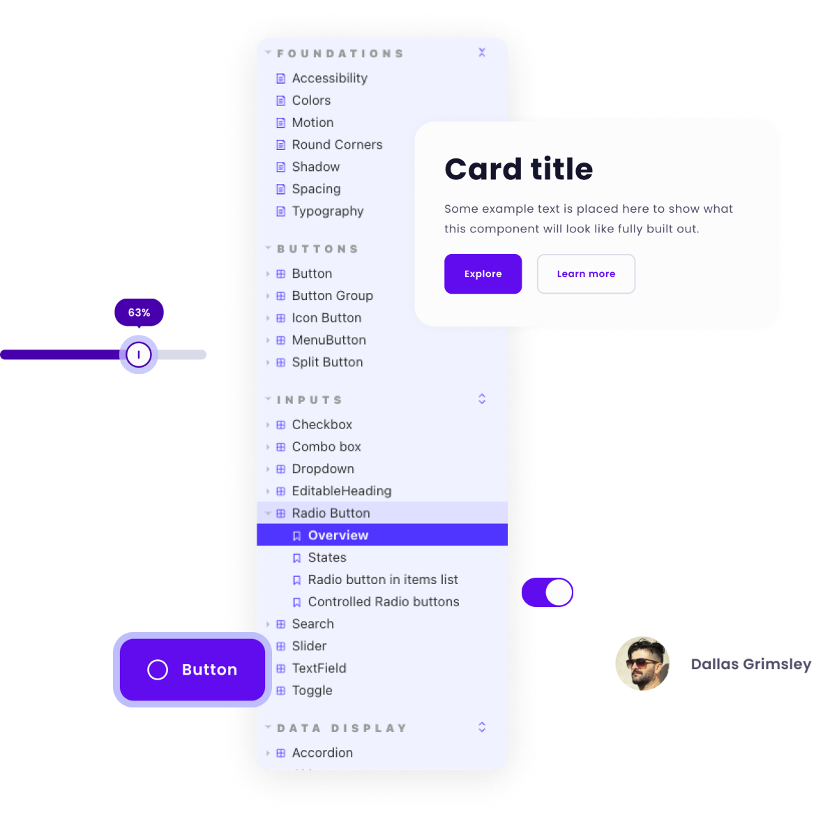
Design Kit
The Quorum Design Kit is a shared Figma UI library distributed to designers. It provides a consistent visual language using UI components and styles for rapid prototyping and mock-ups. We took advantage of Figma's built-in branching and version control, allowing multiple designers to work from the same file. This workflow laid the foundation for how the Design Kit would scale over time and helped create a shared language among designers and developers utilizing the same version control principles. The development of a Design Kit served as a substantial cultural tool as it promoted collaboration between design and development throughout the entirety of the project.
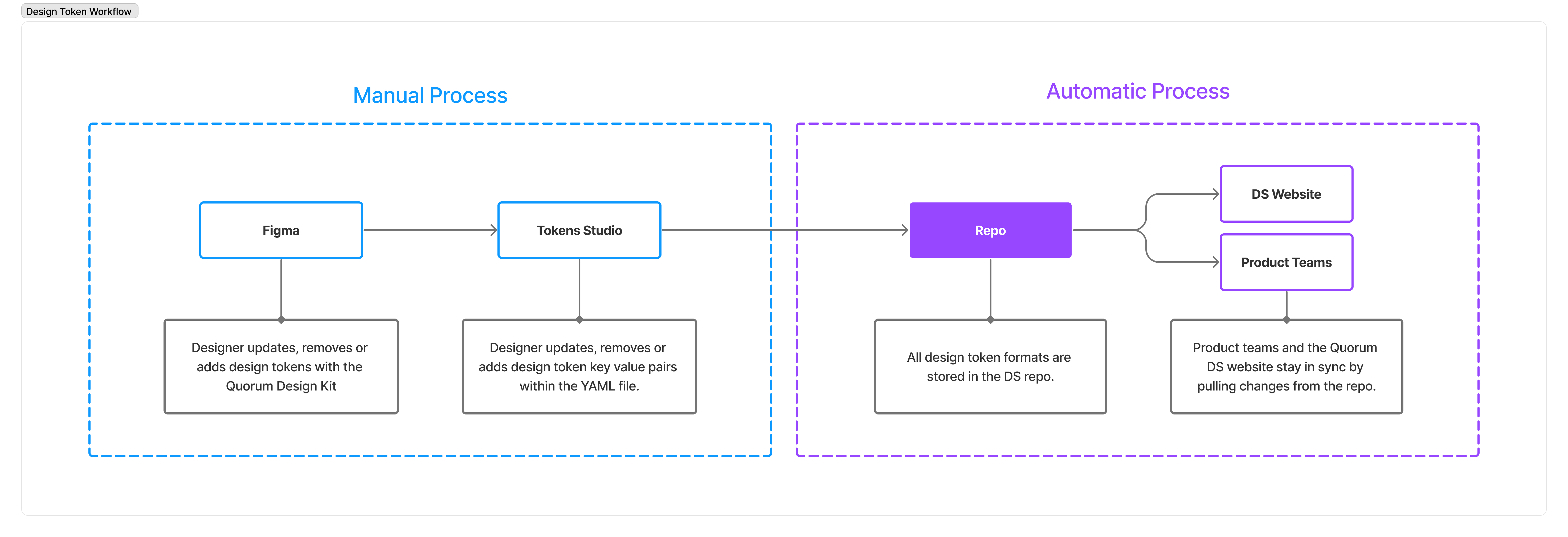
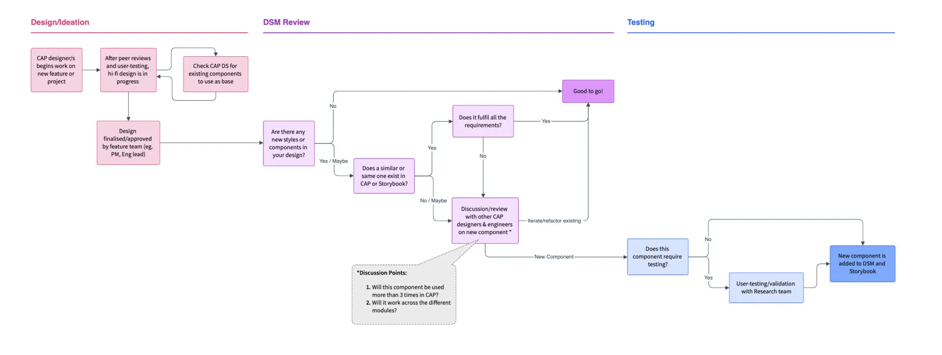
Design Kit Governance Workflow
Figma
- Used by Design Team
- Version control
- Team collaboration
- New design work happens here
GitHub
- Current and past releases
- Notified of new builds/releases
JIRA
- Jira issues to track bugs, feature requests, new components, etc.
- Backlog management
- Promotes transparency
Figma
- Using JIRA issues to manage backlog
- Backlog tasks are done in branches made from
main
Developer Kit
The Quorum Developer Kit is a shared repo that contains fonts, color swatches, and iconography. All CSS styles are component-specific but use variables auto-generated from our Design Token YAML file using Theo, allowing us to manage all of our Design Token properties in one place.
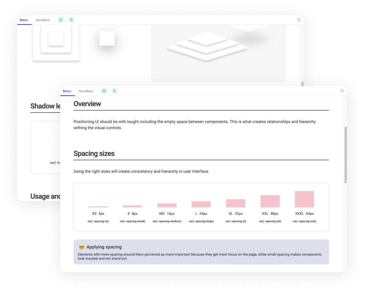
Documentation
The DS Documentation website is the storefront for the DS where everything comes together. It is the living, single source of truth for design guidelines, best practices, component blueprints, code snippets, contribution workflows, resources, and much more. The site was built using Storybook.js, and workflows were established to make it easy for anyone on the team to utilize the documentation. Our documentation was thorough covering the design continuum, from design principles to interactive examples and anatomy breakdowns of each component.
Governance
The governance, workflows, and structures built around Quorum DS are essential to ensure its success. It was vital for us to have a dedicated centralized team that would own the DS and create workflows and processes to how team members would utilize and contribute to it. The graphics below illustrate some of the workflows and processes we established to keep things moving smoothly behind the scenes.
Practice Makes Perfect
Once our team, tools, and processes were established and documented in place, it was time to start designing and documenting Quorum's core UI component library. In conjunction with the app architecture team, the design team worked in design/dev pairs and planned sprints over three to four months. We designed, coded, and documented each core component one by one. During this process, we could kick the tires on the system and workflows we had established and iterate accordingly.
My final thoughts...
The impact of the Quorum DS is felt far and wide, as it is shared across multiple teams, so efficiencies are extended between team members and products. When one team has spent time and effort to solve a design problem, then why shouldn’t another team in your company also benefit from this work?
My team delivered 173 custom components, recipes, templates and variations, covering nearly 100% of the use cases within Quorum. New features were built 80% faster compared to the creation of new components from scratch, saving the company both time and money.