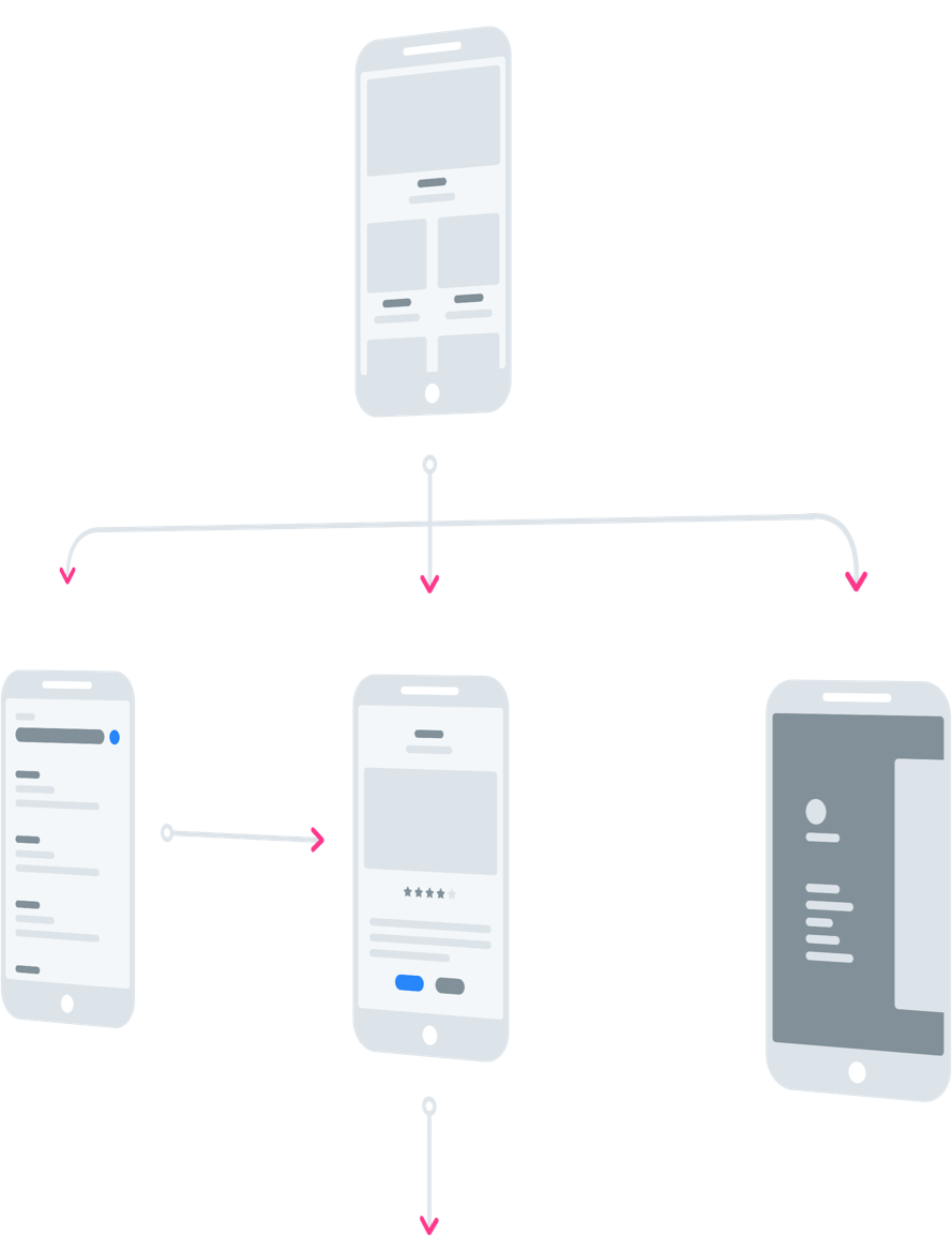
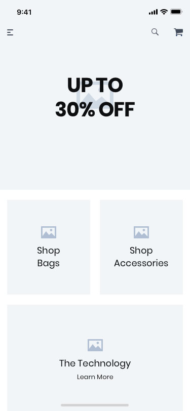
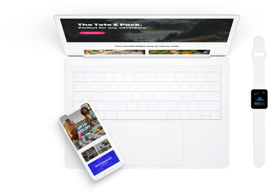
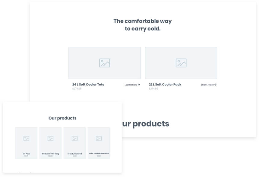
Chill'd Bags

WEBSITE | MOBILE APP | BRANDING | UI/UX

E-Commerce website redesign with mobile app.

CLIENT

Wanting a fresh redesign of their website, company branding, and a new mobile app. Main goal: intrigue younger consumers to experience their product line of adventure totes, packs and more.

Due to an NDA, the client's logo, product images and product content have been substituted.
Me

Propose a refined, minimalistic interface in order to reach the widest audience, without forgetting the brand’s identity.

Details

Role

Project Manager, UI/UX Designer, & Branding Development

Type

Website & Mobile App

Year

2018

User Flows

Since this is an e-commerce website, I wanted to streamline the conversion funnel. This user flow chart was used to figure out what the necessary steps are, and to combine steps where possible.

View User Flows
Low-Fidelity

Wireframes

Desktop

Home Page

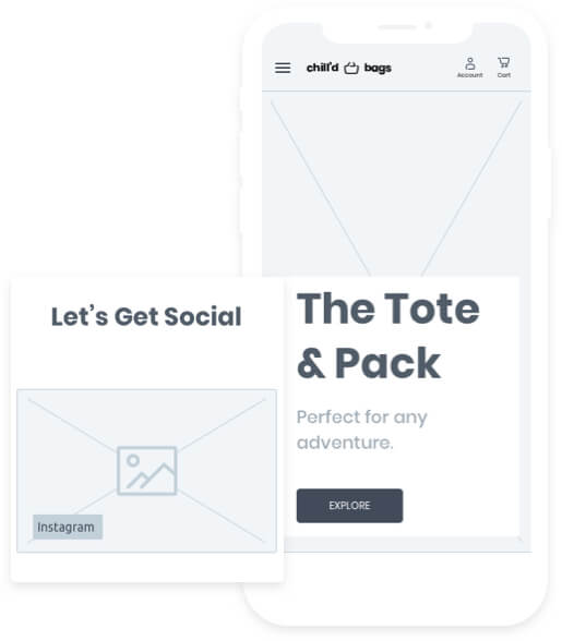
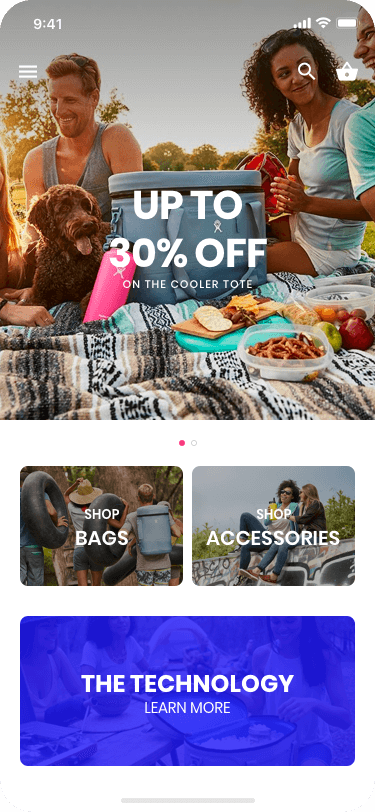
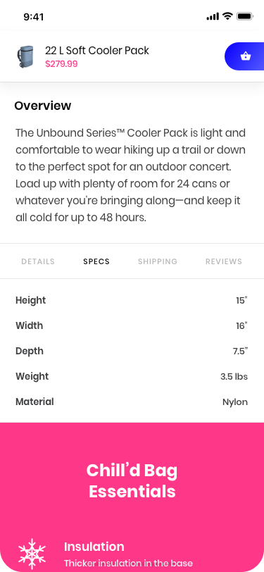
Attempting to make the company feel more personable and have quick access to products. We added a hash tag powered social media section. While keeping in line with the initial requirement, home page imagery shows products being used outdoors.

Mobile

Home Page

The mobile home page layout goal did not change, in that we wanted users on the product landing pages quickly. That in mind, I made the hero section 100% of the vertical height. The CTA in the most natural position for a user's thumb.

Desktop

E-Commerce Products

The client only has 1 product type with multiple accessories so I felt that this page shouldn't include sort or filter capabilities. Keeping things super simple.

Mobile

E-Commerce Products

This attractive looking product grid collapses nicely. Where the main product is up top with its title, price and cta easily seen. The secondary products, collapse into a simple carousel with dots and visualization that there is more to be seen.

Desktop

Product Details

Many e-commerce product pages are the same. You know, they include feature images, descriptions, price, CTA, and much more. One thing that I have found that many sites don't do is install trust. But how do we do this? I suggested showing reviews, shipping and return policies.

Mobile

Product Details

The mobile layout encompasses everything from the desktop while prioritizing items like the cta, price, details, font sizing and optimized images for mobile devices. Giving a mobile user fast page load speeds.

Style of

Typography

Poppins. Domine.

Style of

Colors

Clear. Vibrant. Appealing.

High-Fidelity

Mockups

Benefits

Mobile App

Originally, this client did not have a mobile app. I made the argument that if their goal was to boost sales and reach more people, then a mobile app is needed. Mobile apps are becoming the main outlets for online retail. See below for stats I used to make my argument.

Shoppers prefer apps to mobile browsers

There’s no doubt in the superiority of apps over browsers: 78% of users surveyed claimed they would rather use a mobile app than access a store via a mobile browser.

E-commerce applications are much more convenient to use while shopping, especially if you’re not making a one-off visit to an online store. For starters, there’s no need to remember a URL and login to access the shop. Plus, applications provide better security and speed compared to a mobile browser. Statistics provided by Statista.com

Reduced response time

A major concern for any internet user is how fast a website or an app performs. The time required for a mobile app to complete an action is significantly lower than for a website because applications store their data partially on a mobile device. Although apps connect to servers just like websites do, there’s ten times less data transmitted between a server and a mobile application than between a server and a browser. Consequently, apps retrieve data much faster.

Enhanced UX

The way your store is presented to your customers can make or break your sales. When accessing a site, users expect easy navigation so they can find what they’re looking for. Mobile apps are relatively restricting in terms of layout, which can play into your hand.

User Flows

Even a simple e-commerce mobile app as this one, benefited from careful planning of the user flow. We’re pulling content together and making the building process more intelligible from the start.

View User Flows
Low-Fidelity

Wireframes

Functionality

Watch App

The initial project scope did not include a watch application. However, I felt it was necessary to include a companion application to the client's e-commerce mobile app. But if the benefits of a mobile app are to provide relevant information, discounts, offers, and be a marketing channel, what should a companion app do?

The answer? Greater focus on what the consumer needs while on the go. Previous analytics data from the current website, user views were especially high on order history, order status and shipment tracking pages. Why stop there when we can add notifications on discounts, offers and for admins - low inventory alerts.

Order History

Allows the buyer to get up-to-date information on each order placed online, including shipping updates, delivery, and payment details.

Order Status

A live update that provides timely information on what stage of the order process the product is at.

Shipment Tracking

Showing simple delivery statuses and estimated delivery time without the buy inputing any sort of tracking number.

Admin Dashboard

Admin users logged into the mobile app, will have access to the dashboard. This allows for quick lookup of inventory and orders.

User Flows

The benchmark for interaction with a smartwatch is 2 seconds. Remember, just a few taps should do it. So, I needed to be direct and focused for the type of engagement.

View User Flows
High-Fidelity

Mockups

Notifications

Stay up to date on your order status.

Order Status

Get details on all current and previous orders. Track your order's whereabouts with up to the minute delivery tracking.

Admin Dashboard Access

Admin account holders get generalize information on orders, products status with advanced filter capabilities.

My final thoughts...

Surprisingly enough, none of the assets above were approved to take live.

That's right, this client chose not to proceed after I presented all of my work. Nonetheless, the project has helped me hone in on my user experience and visual design skills.